The True Size of the Map
The Mercator map projection greatly distorts the true size of many countries. The problem is more complicated than simply saying that this map was designed to make certain countries look powerful. The Mercator projection was created for sea navigation purposes, but people often see this map as a true representation of the Earth. This distortions still influences how we understand the size, importance, power and relationship between different countries in the Global South vs the Global North.
Using the true size map dot com website was pretty eye opening. Especially the default view of the website, where it show the size comparison between Africa vs United States, India and China. These three countries, United States, India and China can fit inside the continent of Africa and still have land left to fit couple more countries. Also on the Mercator map Canada and Greenland looks huge. But when we compare it to the continent of Africa they are way smaller. At the first glance it looks like this is intentionally misrepresentation of the true size of the map. It is making the Global North countries looks big and powerful and making the Global South countries looks small and weak especially the continent of Africa. But this is a good map projection for long distance high sea navigation and not to show the actual size of the globe.
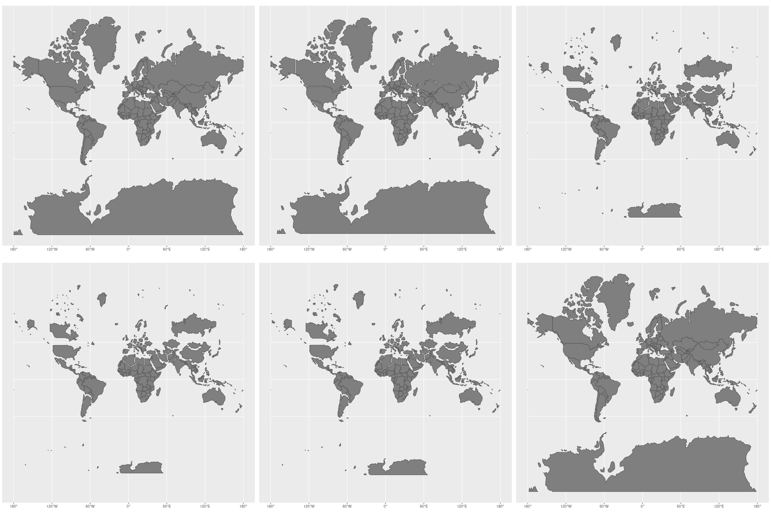
One of the big reason the Mercator map projection creates this distortions is because the Earth is a sphere and in three dimension. The map on the other hand is in two dimension and on a flat surface. The amount of distortions increases on this Mercator Map projection as we go move away from the Earth’s Equator toward the North or the South.1 This is the main reason why high-latitude regions in the North far away from Equator like Canada, Greenland and Russia looks much bigger compared to Continent of Africa which sits on the Equator.2 This projection preserves the actual compass angle and direction, making it super useful for long distance sea navigation. Back in the day before the invention of GPS, it was extremely useful to the get the angle right during sea travel on a sail boat. A few degree off course will take the sailor hundreds of miles away from final destination or permanently get lost in the sea without food or water. This is where the Mercator Map projection came in to help sailor cross oceans. As University of South Florida said about the Mercator Map, “The Mercator projection, developed by Gerardus Mercator in 1569. This spatial projection transformed nautical navigation by representing compass directions as straight lines. It works by projecting the Earth onto a cylinder tangent to the equator, preserving angles and shapes locally but exaggerating the size of land near the poles.”3 This paragraph perfectly summarized what I was trying to say about the Mercator map. This map is a tool created for a very specific need hundreds of years ago before the day of satellite or computer, to do one thing correctly, that is preserve the compass line so sailors can travel vast oceans without getting lost. And it did that job so well that this map got carried around the Globe with sailors for hundreds of years in the past and slowly this map became the default Earth representation on a flat paper on people mind for hundreds of years, all over the world. If you go to a classroom in New York or a classroom in some rural Bangladeshi or African school, I am certain you will see this Mercator Map projection hanging on the wall. And this is where we have a problem.
Last semester, My Introduction to Geographic Information System class on map making changed how I see issues like this. A map is not simply a black and white photography of the Earth. We have other technology for that, like radar, sonar and different satellites. As I said before, the Earth is a three dimension object, on the other hand, this common Mercator map projection represent it on a flat, two dimension surface. This is why, when we make map we can not 100% truly and perfectly represent the true Earth. We have to make sacrifice somewhere, depending on what is main the purposes of that map. Every map in the world has different strengths and weaknesses. As, Ashley Gomez, my classmate wrote on another classmate, Luisiana Guzman’s post, “It made me think about how we usually accept maps as accurate without questioning what might be distorted or left out.”4 I 100% agree with my classmate here but I want to add one more thing we should ask about every map we see that is, “Accurate for what purposes”. Like how Mercator map is very useful for navigation but extremely bad when someone uses it to compare the actual areas of countries that are on the different places on the Globe compare to the Equator.
As I said at the beginning on how the Mercator Map Projection, making the Global North countries look big and powerful and making the Global South look small and weak. This does not mean that the Mercator projection automatically makes people believe that Global North countries are more powerful than Global South countries. That would be too simple. But still there can still be a connection between geographic representation and how people understand the world. I also believe the reason why this map become the default in school all over the world because of European colonization. The same reason prime meridian is in Greenwich England, North is up and English is the language of sky. If someone repeatedly sees some countries looking much larger than they actually are, that visual representation can become part of their understanding of Earth’s geography. This is why it is very important that people know the purpose of maps and different distortions when they see any maps. We should make mandatory disclaimer on every maps next to legend, in a few sentence explaining the distortion and how that might affect the true representation size or other things on that map.
Finally, learning about the True Size Map and reading my classmate’s different but mostly similar perspectives had an affect on how I see the Mercator Map Projection. At the beginning, I mostly saw the map as a distorted representation that made Global North countries look bigger and more powerful while making the Global South look smaller. I still believe that the distortion can affect how people understand the geography of the world, but I now understand that the reason behind the distortion is more complicated. This Mercator projection was created for a very important practical purposes, sea navigation, and it’s distortions were not simply created to make countries in Europe look bigger compared to Africa or Asia, nor to make Europe look stronger. The bigger problem is that we often forget that maps are just tools created for a specific tasks and start to treating them as if they are the true representation of our Earth’s geography. My previous GIS class and the perspectives of my classmate taught me that when we look at any maps we should ask not only “Is this map accurate?” but also “Accurate for what purposes”.
Understanding how map projection and distortion works will help us become better at knowing the true shape and size of our planet and political boundaries and avoid forming assumption about different countries based on how they look on a flat map.
- BBC News, What Different World Maps Get Right and What They Get Wrong.
- “National Geographic Society, ‘Equator.’”
- “University of South Florida Libraries, ‘Navigating the World with Mercator Projection: Past and Present.’”
- “CUNY Brightspace, Discussion Board Week 1. Luisiana G.”